Yes for Highline
Elevate their brand and mission to support the passage of levies for Highline Schools.
Overview
Yes for Highline needed a new brand and site to raise awareness of their levy in the upcoming election.
Impact
The levy passed in the November 2020 ballot with 73.66% of the votes!
Role
Responsibilities: User research, user interface design, brand and visual design, website development, client management
Tools: Illustrator, Photoshop, InDesign, Wix, Miro, Google Docs
Process
Yes for Highline is a non-profit supporting levies to fund initiatives for Highline Public Schools. As an alumni, I was excited to give back to the teachers and staff.
After the initial discovery session with Long Phan, the Yes for Highline President, we defined these goals:
Business goal:
Pass the bond (more than 60% of the votes) to fund the re-construction of a set of schools (which then pivoted to technology resources to support remote learning due to COVID) within the Highline School District.
Audience: Registered voters in the Highline School District districts.
Project goals:
Clearly communicate the bond to voters.
Speak the language of the diverse community to gain their trust and support.
Allow the brand and site to grow consistently over the next few years.
Deliverables:
Brand (logo and style guide)
Website template
The first step in the process was to conduct user research to understand the needs of the target audience: voters in the Highline School District districts.
Define the goals
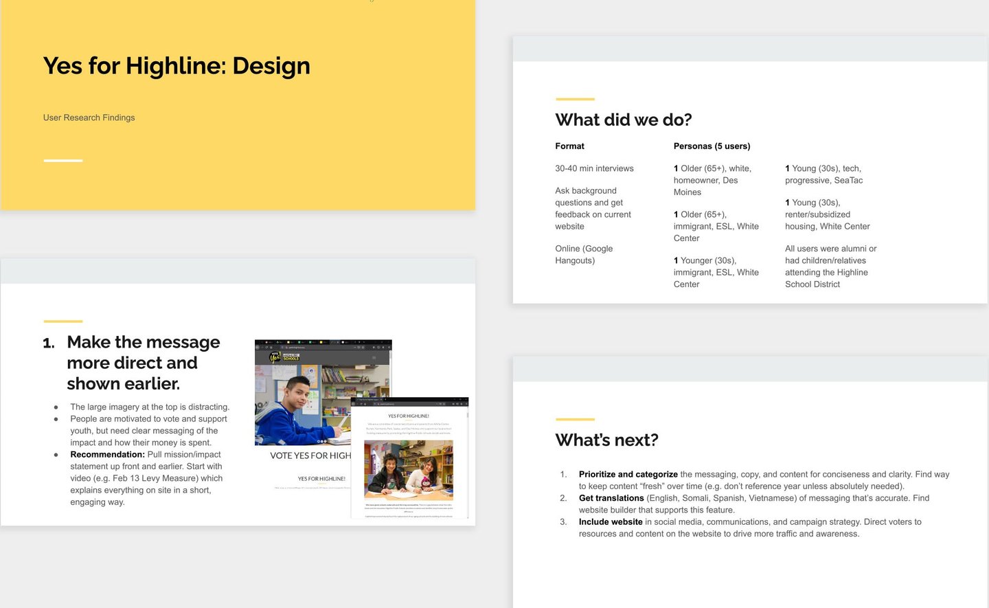

Highlights of the user research.
I interviewed 10 community members (parents, working professionals, and alumnis) by getting their feedback on the existing brand and website. I also reviewed past voter demographics provided by the team.
While many people understood the Yes for Highline mission, most were overwhelmed by the amount of content and disorganization on the existing site.
I analyzed the interview data and summarized it into six top findings for the project team:
Make the messaging direct and show earlier.
Advertise the website more.
Provide categorization and reduce content.
Resources are helpful, but lack purposeful messaging.
Make content more accessible with translations.
Overall, current logo and branding is neutral and clear but lacks personality.
Each finding had a proposed recommendation to consider in the new design of the brand and site. Overall, reducing the content and making call-to-actions clearer were the most voiced needs.
Connect with the learner
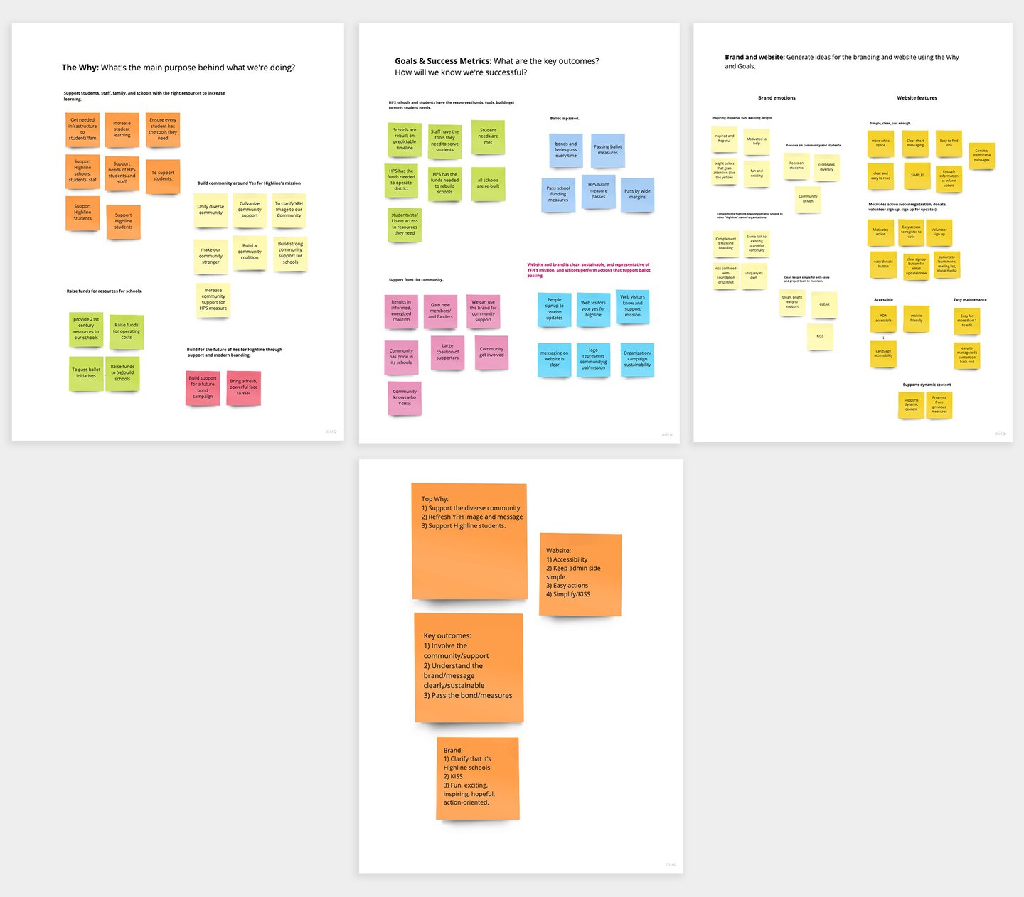

The end results of the discovery session with the team using Miro.
Align on requirements
From there, I facilitated a discovery session with the project team in which we aligned on the why (north star), project goals and outcomes, and website features.
I guided the team to use the user research findings and learning objectives to make important design decisions. It's key to align early on to drive everyone towards the same north star, and revisit these requirements when unexpected decisions happen down the road.
It was also helpful to get historical context behind the design decisions that led to the look and feel of the current site and brand.
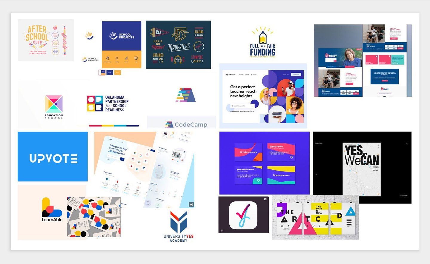

The logo design process. I start by creating an inspiration board based on the brand values. I share this with the client to validate the direction, and understand what they like or don't like. The team liked the examples with bright colors and clear call-to-actions.
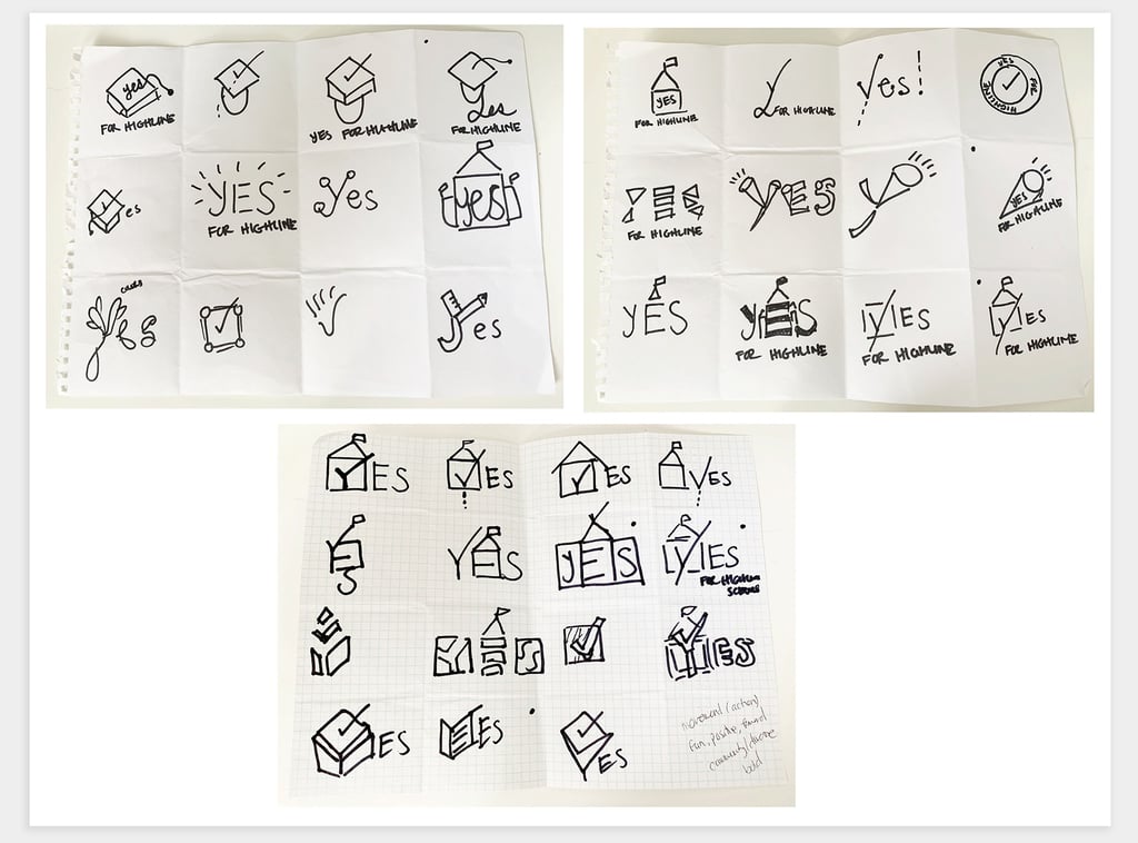
The grid of possibilities. Next, I sketch as many logo ideas as possible on a grid. This paper and pencil format challenges me to explore and stay creative without getting committed to any ideas. I have a lot of fun at this stage.

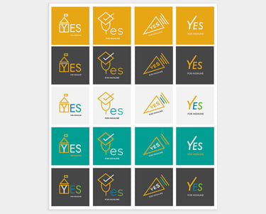
Explore early versions. I played around with the colors and thinner lines. The client wanted the "check mark" to be more prominent.
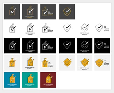
Iterate on different options. I explored a more playful feel for the logo. I narrowed down on the colors based on client feedback, and explored black and white versions.
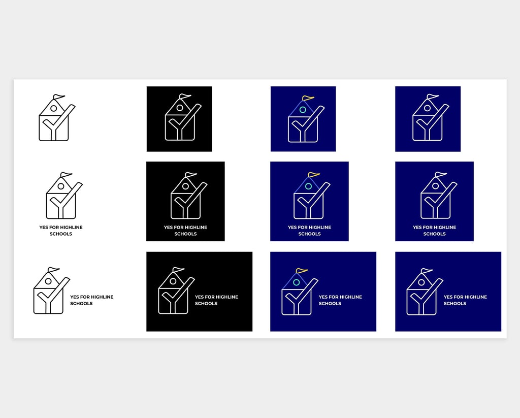
Narrow on a direction. The "check mark" and "Y" is bolder, and we started narrowing down on the color palette.
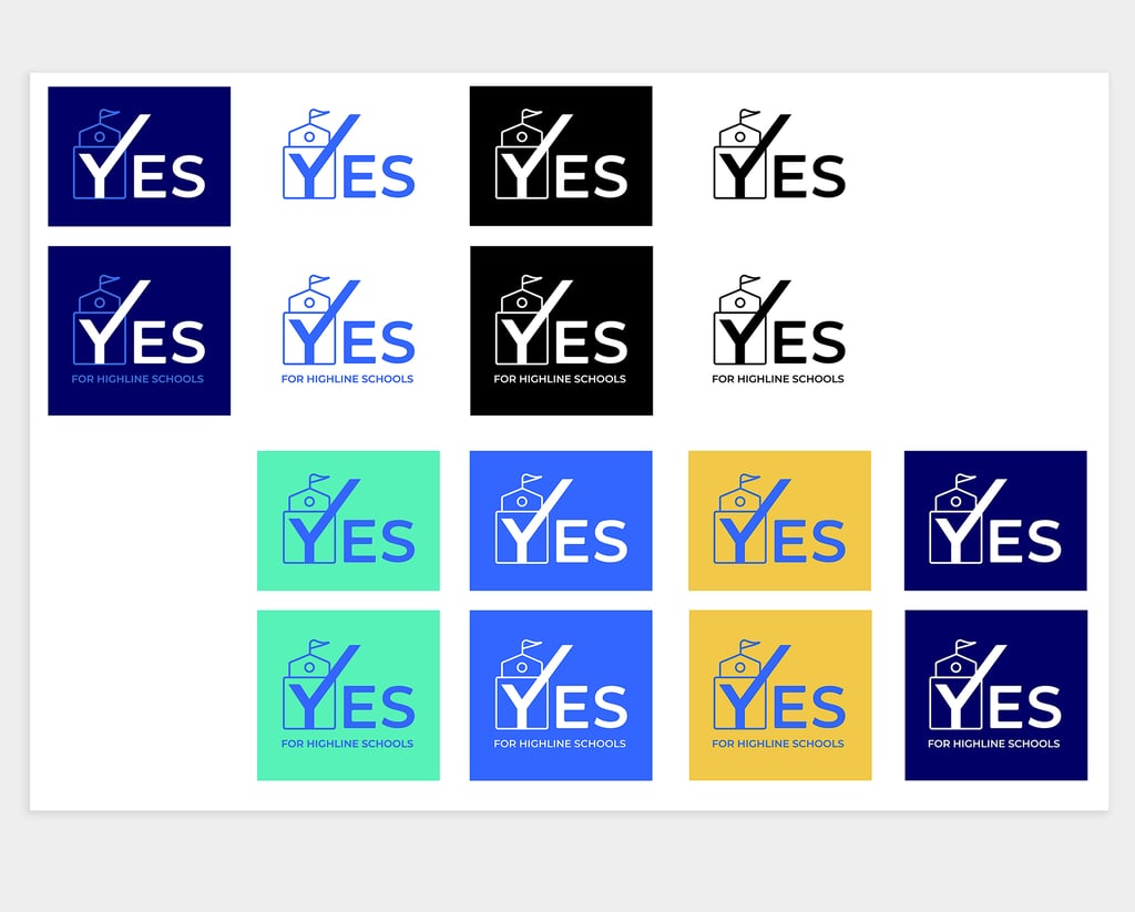

Bring the bold. We made the "check mark" more prominent and used sharp edges to emphasis the action value of the brand, and ultimately, encourage people to vote YES!
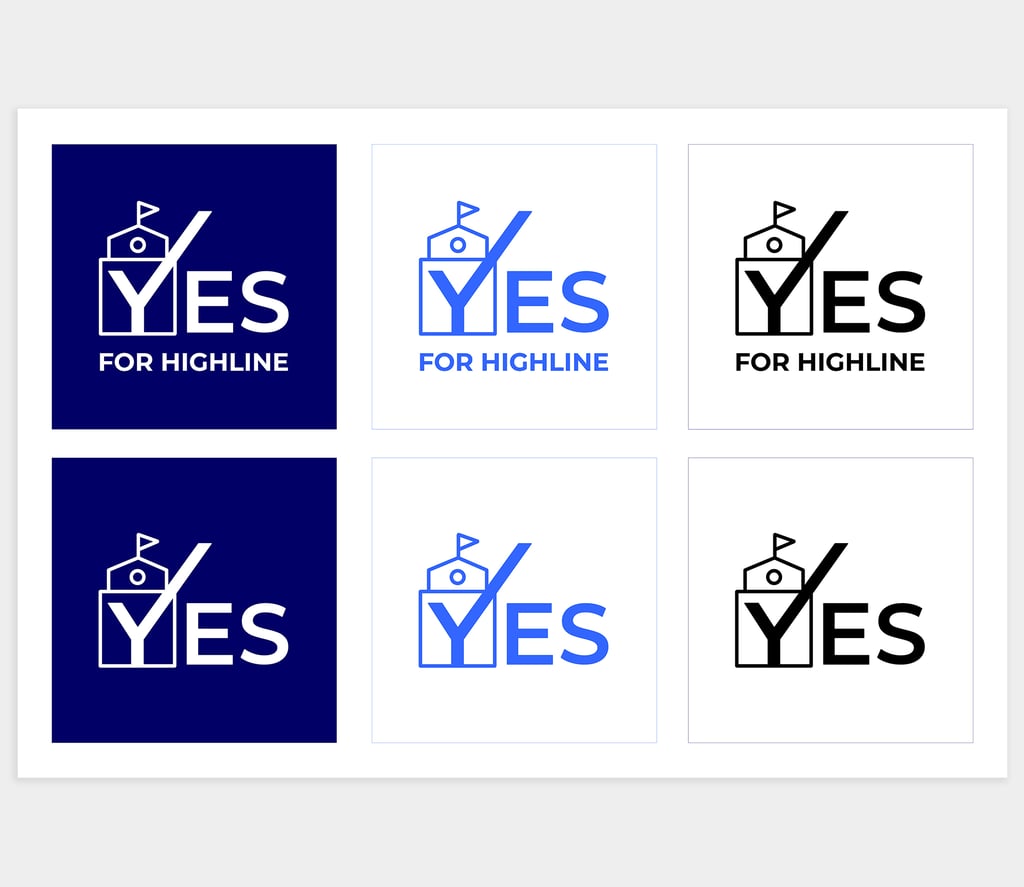
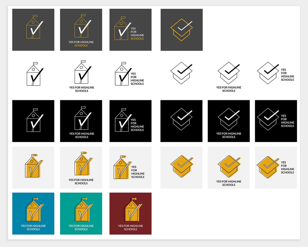
The final logo. We designed the logo to be action-oriented, inspiring, and representative of our mission. Capitalized letters, the movement of the checkmark, sharper corners, and a school building to represent our mission. Our logo is bold and forward-thinking.
Create the logo
I usually start the logo design process with clearly defined brand values. From the discovery session, the Yes for Highline brand values were:
Be inspired
Be connected
Be active
From there, I created an inspiration board based on these values: bright colors, geometric shapes, and clear call-to-actions. I shared this with the team to validate we're going in the right direction, and they shared what they like or don't like.
Then, I was off and running! I started sketching as many possible logo versions on a grid to explore and challenge myself to think outside of the box. I started seeing a creative relationship with the "check mark" vote and the "Y" of Yes for Highline. I continued building off of this visual theme with education elements: a schoolhouse, books, sun rays, etc. I did a quick review with the team, and they liked the "check mark Y" in the "YES" word. It signified action (voting "yes") and clearly showed the Yes for Highline name, especially as the logo will be used on yard signs, flyers and more physical and online marketing channels.
After multiple iterations, we landed on the final logo. We designed the logo to be action-oriented, inspiring, and representative of our mission. Capitalized letters, the movement of the checkmark, sharper corners, and a school building to represent our mission. It's bold and forward-thinking.

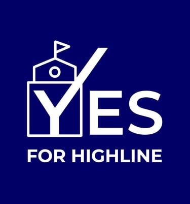

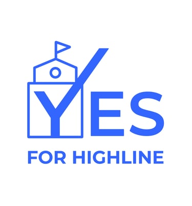

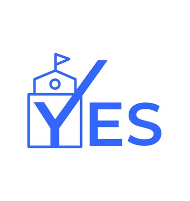

Primary logo with text
Primary logo without text
Secondary logo with text
Secondary logo without text
Black and white logo with text
Black and white logo without text

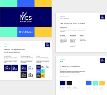
Highlights of the brand guide, a resource for the client and team.
Design the brand guide
With the logo and brand values defined, I created the brand guide. It's a resource for the team and future members on how to properly use the brand.
The guide included content like the vision, audience, brand values, logo treatments, color palette, and voice guidelines.
Curious? Explore it in detail below.
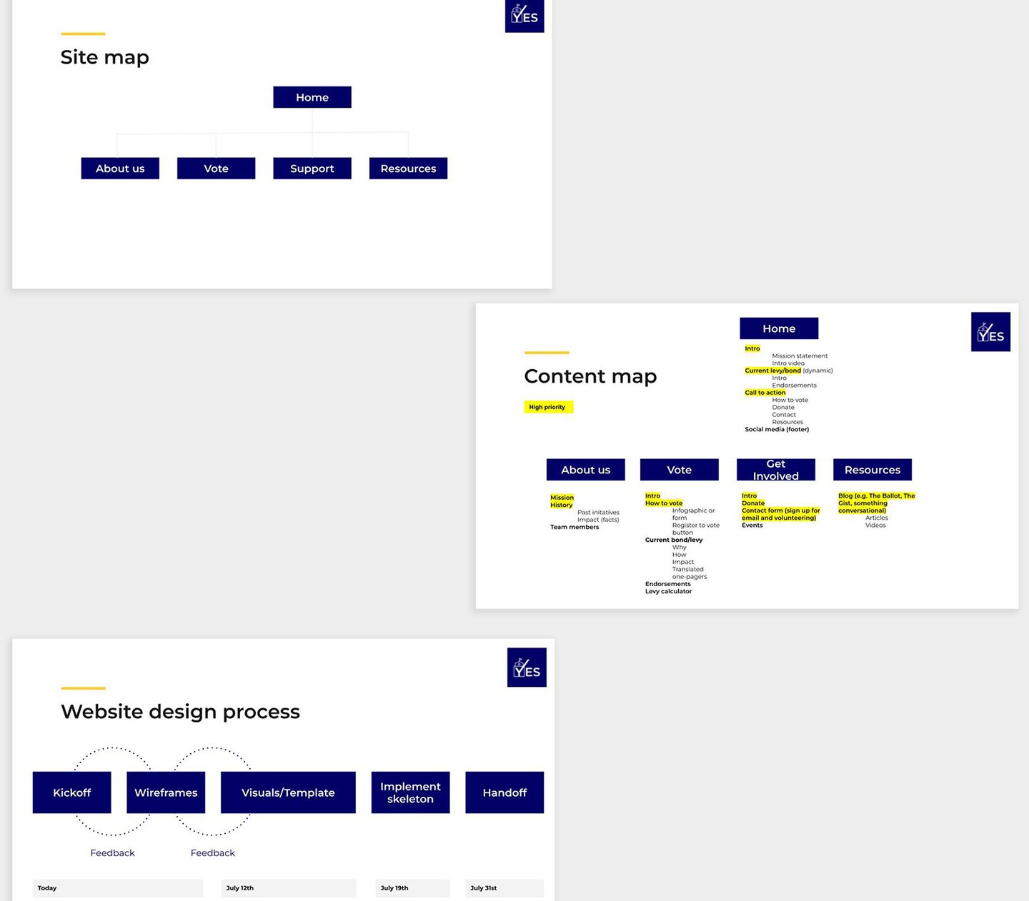
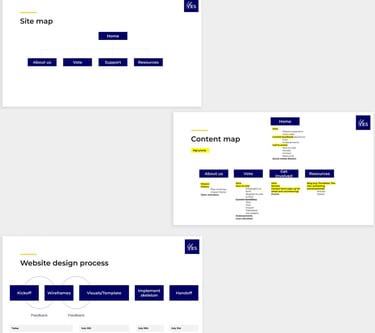
Drawing from the initial website requirements, I proposed a timeline, site map, and content map for the website template development. The team prioritized the content necessary for the launch.
Build the website
The goal of the website was to create a template, with the new Yes for Highline brand, on an user-friendly WYSWYG platform for the team to maintain.
I researched website builder platforms that would be easy for the team to pick up and maintain while staying within their budget. We landed on Wix.
I mocked up the website template using a theme customized to the Yes for Highline brand. The designs focused on a modern experience using the new brand, white space, and selective, intentional content. From there, I built the website template in Wix. When the shell was built, I shared it with the Yes for Highline team for feedback. They provided a lot of good insight on the content they planned to feature, which help me build more intentional layouts.
During this time, the decision was made for schools to continue teaching remotely due to the COVID pandemic. We pivoted the campaign to support the Yes for Highline tech levy, which would guarantee laptops and reliable internet access for students and training for teachers to successfully navigate remote teaching. This impacted the content and graphics we'd feature.
After a few iterations, the website template was ready to hand off to the Yes for Highline team to populate content and get it launch ready!
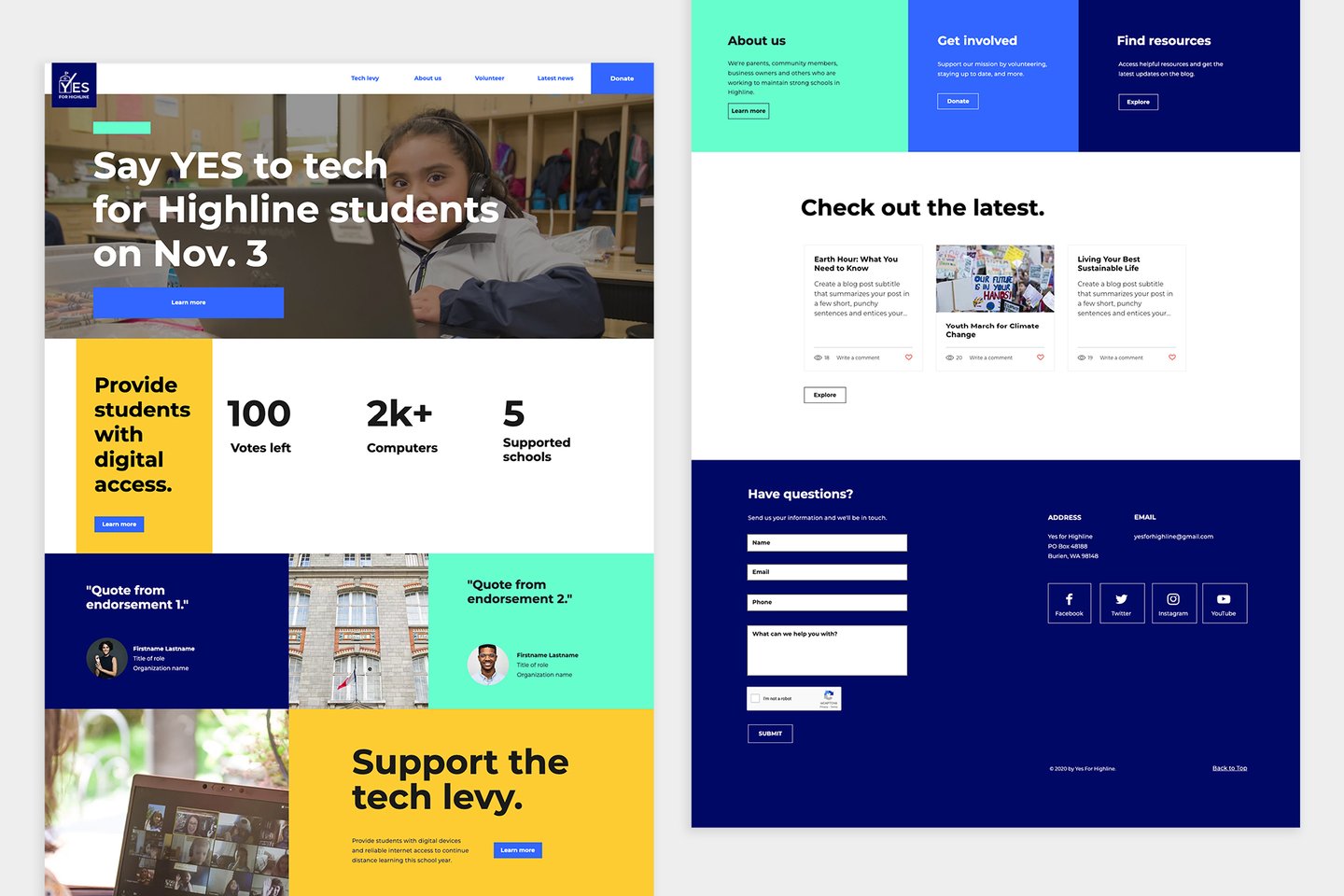
The home page has a clear call-to-action and message.
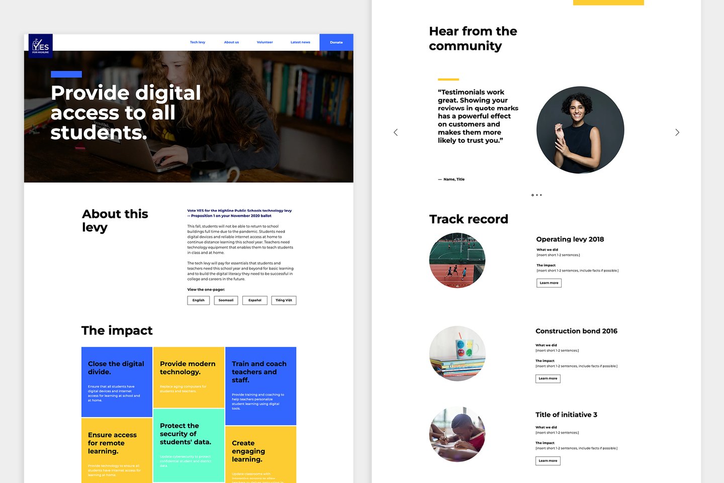
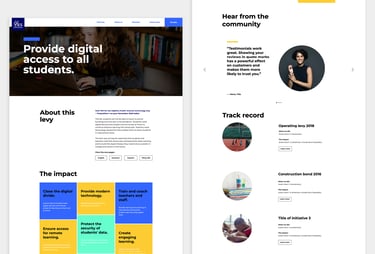
The levy page features information about the current levy, the impact of your vote, and past successes. The translated one-pagers was an idea to address a localization need voiced by diverse voters living in the school district.
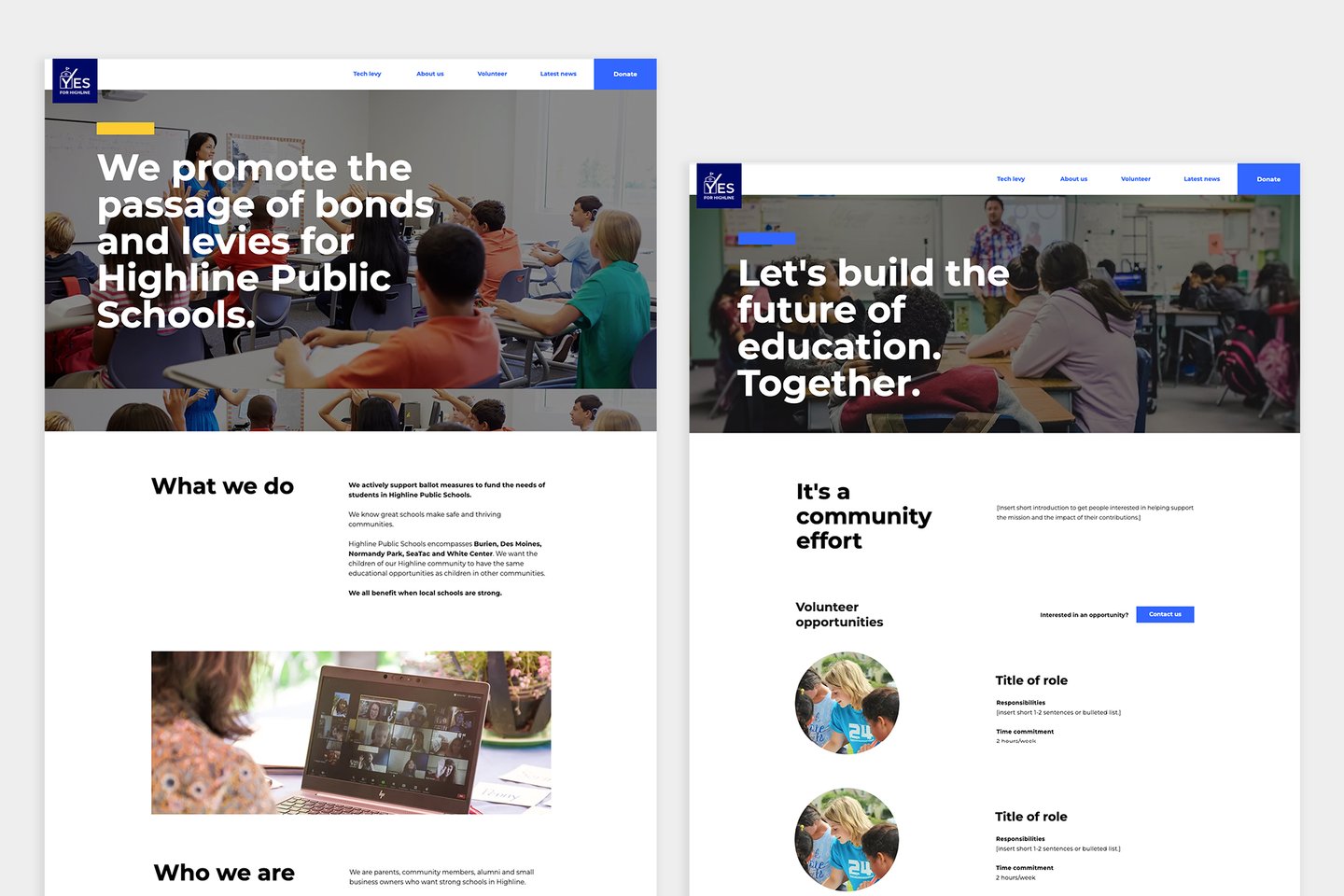
The About and Volunteer pages consolidated information in a quick, scannable layout for users.

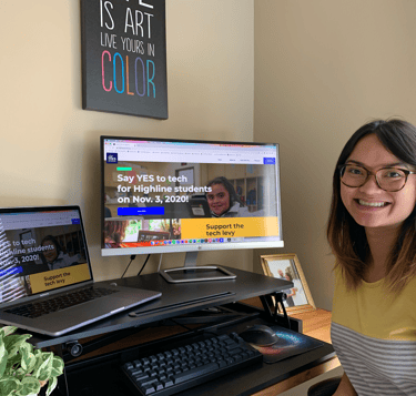

Celebrating the launch of the new Yes for Highline website ahead of the campaign.
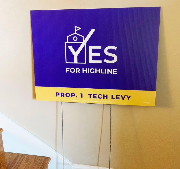
Yard signs with the new brand were placed in neighborhoods eligible to vote for the levy.
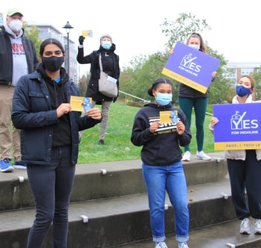
Highline School district students and parents raising awareness of the tech levy.
Set up for future success
To set the team up for success, I created a one-pager that linked to the brand guide, resources, and tips so the team can easily maintain and build upon the Yes for Highline brand.
In the months later, I saw the new brand on yard signs in the neighborhoods, marketing emails about the levy, and more. It was meaningful to see the work we did together in the community. It was even more so when the tech levy featured in the ballot book! The levy passed with 73.66% of the votes, providing funds to supply resources for students and teachers with online learning during the COVID-19 pandemic.
I'm excited for this work to continue to help Yes for Highline raise awareness about their mission, and support the passage of future levies for the students, staff and teachers.
Impact
On the client
"We hired Christina as our designer for a community-led campaign organization called Yes for Highline, which helps to pass school funding measures for Highline Public Schools.
Christina developed a thoughtful process for a brand refresh and logo redesign, gathered input from key stakeholders, and was able to pivot quickly as a result of changing needs and feedback.
Christina's final logo and brand were featured prominently on our website, social media & advertising, which included almost 100,000 digital impressions, 7,000 doorbell fliers, and 300 yard signs at high traffic intersections.
Christina's work helped us launch a reinvigorated campaign in Fall 2020 to pass a technology funding measure by our highest margin ever--73.66%--which guaranteed equitable access to laptops and internet access for students and teachers during the COVID-19 pandemic.”
Long Phan / President @ Yes for Highline
