
Koru's Nuturing Emails
Support recent college grads with a personalized job search experience.
Overview
Before being acquired by Cappfinity, Koru was a start-up focused on bridging the gap between college grads and the job marketplace.
I designed a series of nurturing emails to encourage applicants to complete their job application process on Koru's platform.
Impact
While the email series didn’t get released due to the business pivoting in a different direction, I learned how thoughtful and supportive design can empower professional development experiences for individuals.
Role
Responsibilities: User research, user experience design, visual design, client management
Tools: Sketch, lllustrator, Photoshop, Google Docs
Process
The project came about in a conversation I had with Koru's Director of Marketing. Registered users were abandoning their job application on Koru's job matching platform. They needed a way to bring them back into the process.
After meeting with the Koru product team, we landed on this vision:
Design problem: How do we encourage and educate registered users to complete applications?
Audience: Registered users who are recent college grads seeking employment.
Goals:
Encourage registered users to return and browse jobs
Encourage registered users start an application
Encourage users to complete an application they started
Encourage multiple applications per user
Encourage users to successfully complete the process towards an employer introduction
Deliverables: A set of nurturing emails within these themes:
Welcome
Digest
Don't abandon me
Keep going
Feedback and outcomes
The first step in the process was to conduct a competitive analysis.
Define the goals
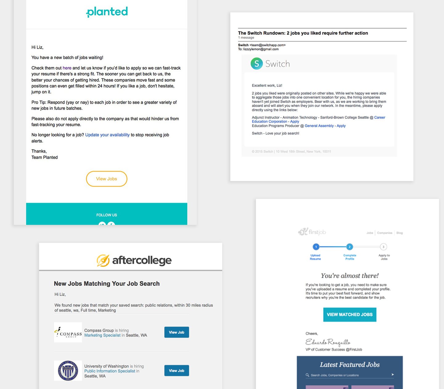
Highlights from the competitive analysis presentation shared with the Koru team.
The product owner and I mapped out a project plan that started with a competitive analysis.
I researched the email experiences of organizations in the same industry as Koru to understand the spectrum of possibilities. This included Planted, Freelancer, and more.
What did their emails look like? What was the tone of voice and delightful microinteractions? What made their job search experience unique?
I found these themes in the email experiences of similar products:
Always be humanistic (use conversational language and micro-interactions).
Be direct with next steps and call-to-actions.
Provide incentives, alternatives, or guidance when an application is abandoned.
Do half the work for the user when encouraging multiple applications.
Celebrate wins and performance.
Learn from competitors
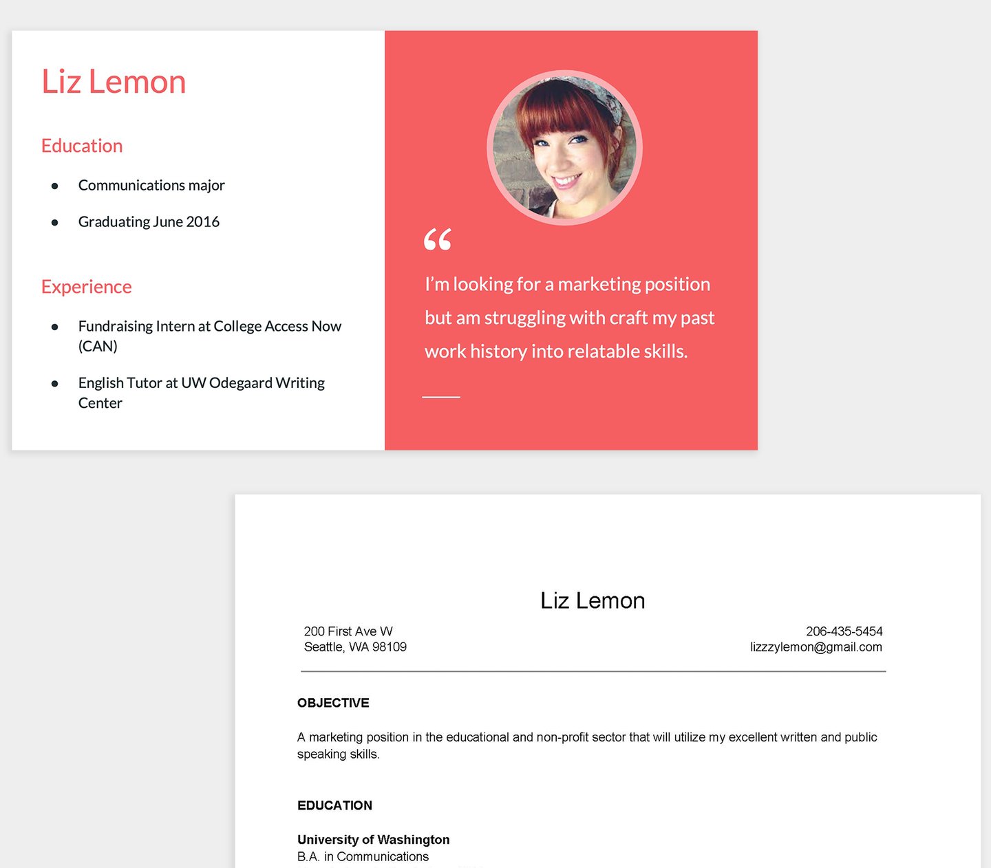
Meet Liz Lemon, our persona.
Anchor on personas
Personas are fictional humans that help us better understand the end user's emotions, thoughts, and motivations as they go through an experience.
From the competitive analysis, I built a persona named Liz Lemon (yes, an ode to my favorite character on "30 Rock") to anchor our design decisions on the target audience of a recent college grad.
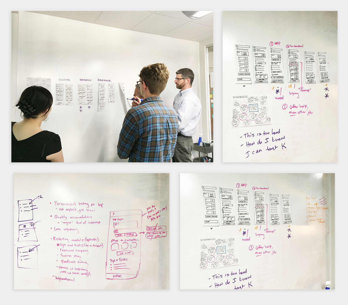
I facilitated a design sprint with the Koru team to align on requirements, prioritize user needs, and brainstorm interface ideas for the emails.
Collaboratively define the experience
I facilitated a two-part design sprint with the product owner, lead UX designer, developer, and project manager to brainstorm the nurturing emails experience. We called them "nurturing" because the design problem we were trying to solve was: How do we encourage and educate registered users to complete their applications?
First, we solidified our problem statement, target users, and their core needs. Second, we outlined the key emails and discussed considerations for the user in the job application process.
We landed on five key emails:
Digest email
Partial application email
Closed job email
Application confirmation email
Coach feedback email
It was a collaborative process that helped me learn more about Koru’s business model and the multiple ways users interacted with Koru’s suite of tools, resources, and more in their job search.
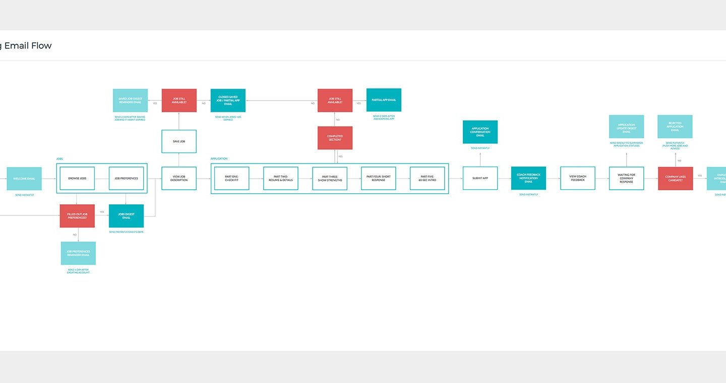
Email user flow. I created this flow to map out the email experience and define the user actions/decisions that will trigger a specific email.
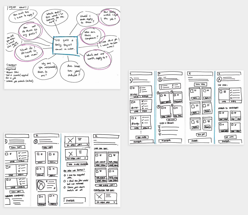

Mind map + sketch. To step into the user's shoes, I mapped out questions they may have when they interact with an email. Those questions, along with the project goals, guided the design of each email (this example is for the Digest email).
Design the emails
I created an email flow that applied ideas from the design sprint. It mapped out the experience and outlined when and how the user would get an email. The Koru team provided feedback on the email's triggers and provided valuable knowledge of the job platform to ensure the experience was cohesive.
I created a mind map and sketched possible interfaces for each email. The mind map is a way for me to step into the shoes of the persona, Liz Lemon, and think of all the questions she may have at a specific stage of her journey. Those questions ensure the design addresses the user's core needs.
Since the project timeline was short, I evolved the sketches straight into visual mocks. During the feedback sessions, the Koru team and I worked through the language and tone, triggers, and operations behind the email.
Language and voice was important in the design of these emails to encourage applicants to continue the process, as job hunting can feel daunting. We incorporated support through coaching feedback, positive voice and tone, and clear actions to encourage users to move forward.
After several iterations, we landed on the final versions of the emails.
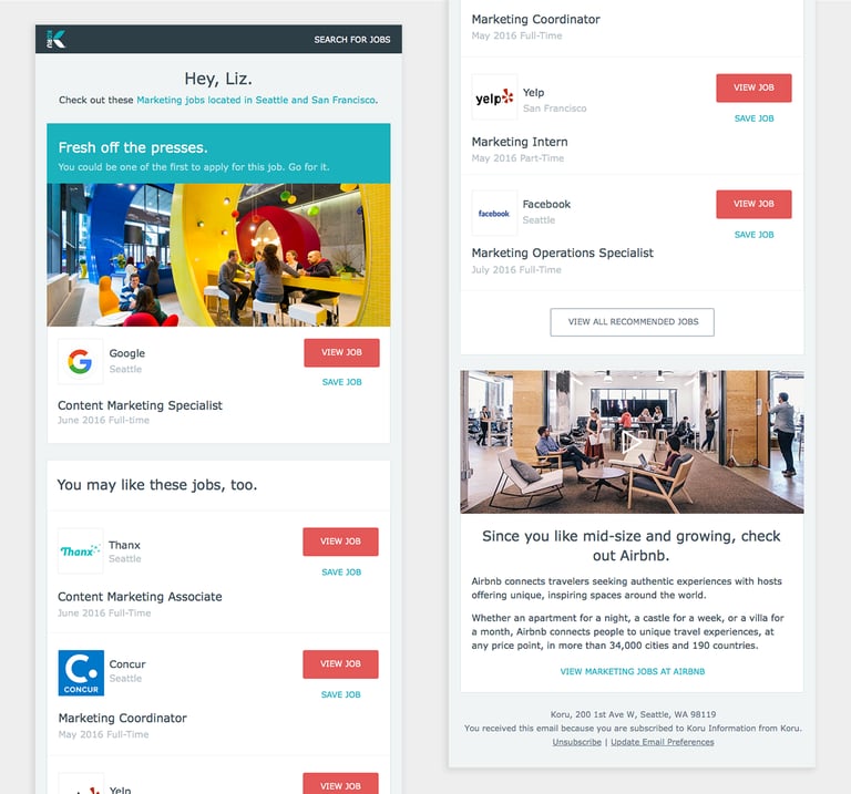
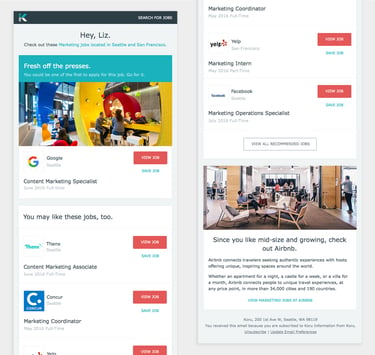
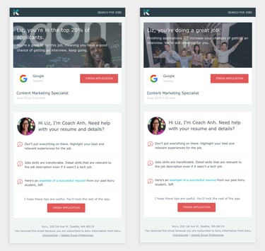
The digest email sent instantly/daily/weekly encourages users to apply to as many matching jobs as they can.
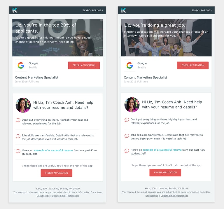
The partial application email provides support for users who haven't finished their job application. Different messaging appears for applicants who are a "good fit" (meets most of the requirements).
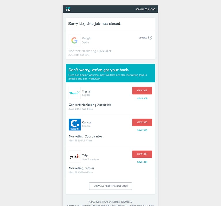

The closed job email notifies users when a job they've saved or started applying for has closed. It shares similar jobs to encourage them to continue their search.
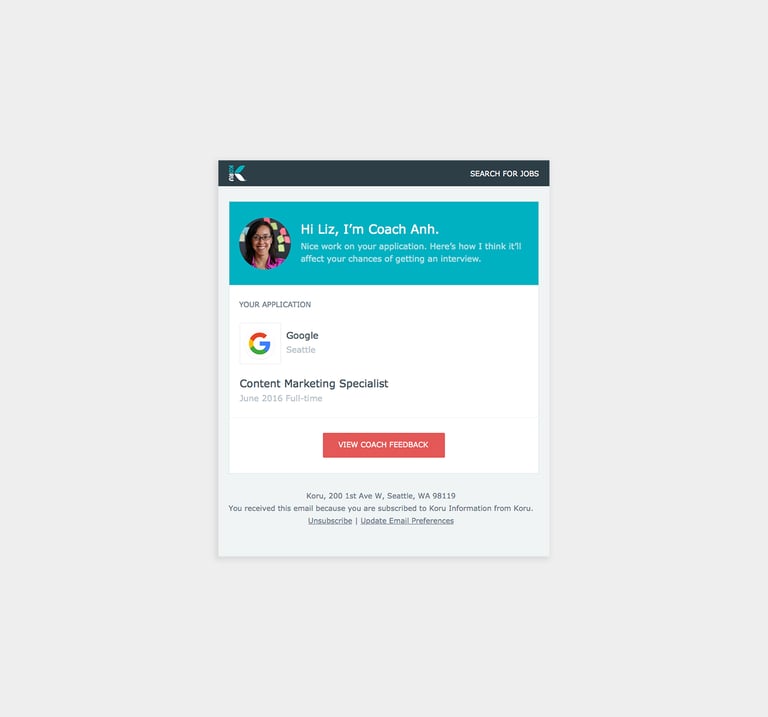

The coach feedback email notifies users of feedback they've received on their application from a Koru coach.
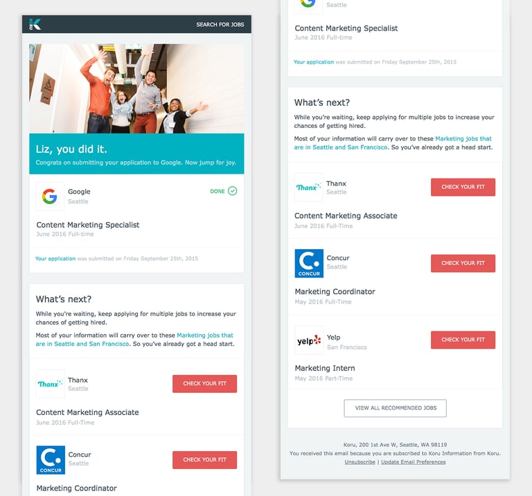
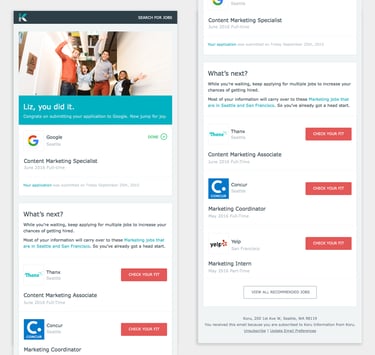
The application confirmation email congratulates users for successfully submitting their application for a job. It encourages them to apply to other jobs and highlights how easy the process is.
Wrap up
Once we landed on the final designs, I annotated the visual mocks and provided handoff materials to the client.
From there, it was up to Koru on how they wanted to use the nurturing emails. In the end, the business decided to pivot in a new direction and although the email series didn’t launch, I learned a lot through this project.
Impact
On myself
I learned that:
Bringing design thinking to the educational and professional development space is exciting—and my passion for design + learning grew from there!
You have to onboard quickly to understand a client’s business model, goals, and styles.
Sometimes with client work, your designs may not launch due to decisions outside of your control, but you’ll learn something new in the journey.
